
Thursday, December 20, 2012
On the third day day of photoshop...
On the second day of photoshop...

On the first day of photo shop...


For this project we had to bring an inanimate object to life.
I chose lipstick, my first try was alright, but my second try was alot better. it looks alot more realistic.
Wednesday, November 14, 2012
Book Cover


For this project we had to one, draw a character, so i did star girl from one of my favorite books. Then we had to make a bookcover out of our drawings. I made my book covers look like they were the same series but different stories. Im pretty proud of the outcome.
Wednesday, October 31, 2012
Aisha

Retouching


Text
.jpg)
Disney Newimal & Magazine Cover
.jpg)
.jpg)
This is probably the project I'm most proud of so far. We had to make Two Disney animals into one. I chose Tinkerbell and dumbo... which was a lot harder than i expected because they're such opposites. then after we did that we had to make a magazine cover with the Disney newimal and put 7 stories on it, and a bar code. i tried color coordinating it towards the character, and making the magazine more of a sleaze magazine, which i think turned out great.
Stamps
Stamping was a fun project, we had to take images and turn them into stamps on Photoshop. I did two, one an elephant, the other a tree. The elephant one i tried making it look like you should have 3D glasses to look at it, i love it. this project was really fun and i enjoyed it a lot.
.jpg)
.jpg)
elephante
.jpg)
BRATZ
.jpg)
.jpg)

.jpg)
.jpg)
Friday, October 19, 2012
Disney Newimal

Friday, September 28, 2012
Friday, September 7, 2012
Pupowl

Gradients


These are my practices from the gradients lesson today. They were pretty easy and simple, and everyones looked the same haha, but i learnt alot of neat techniques that i can now use in photoshop.
Thursday, September 6, 2012
Childhood Yummy
Bicycling Is a Lifestyle

Oinkers

Chevron Bunny

Friday, August 31, 2012
Frog Tongue
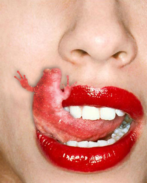
- I love my final piece, i think it came out really well.
2.How successful do you feel this piece is and why?
- I think it is pretty successful, it was hard but i tried to make the same colors of the tongue go all the way through, so it looked somewhat real.
3.What worked about this project? What didn’t work?
- What worked is the color of it all the way through, and what didn't work is, maybe the hands? they kind of look like there not on the face.
4.If you were to do this project over again, what changes would you consider making?
- I would consider changing the shadow behind the hands so they look more realistic.5.What was the most difficult part about completing this piece and why?The most difficult part was definitely making the texture and color follow all the way through the tongue.
6.What did you learn from this piece?
I learned how to one make a frog look like a tongue, to make shadows, and also forming the tongue and frog together.
Thursday, August 30, 2012
Angry Pancakes

1. Describe your overall thoughts on the final piece.
-My thoughts on this piece is that I loved the project, and that I'm excited that i now know some of the basics of photo shop.
2. How successful do you feel this piece is and why?
2. How successful do you feel this piece is and why?
-I did a lot better on this project then i thought i would, because I've never been good with computer software's.
3. What worked about this project? What didn’t work?
3. What worked about this project? What didn’t work?
-what worked is the color and size of the mouth, what didn't work is maybe the blueberries on top, i could have done something with those.
4. If you were to do this project over again, what changes would you consider making?
4. If you were to do this project over again, what changes would you consider making?
-I would change the blueberries, and maybe have him also eating something.
5. What was the most difficult part about completing this piece and why?
-The most difficult part was making the perfect size opening for the mouth.
6. What did you learn from this piece?
6. What did you learn from this piece?
-I learned a lot, like how to use some of the basics of photo shop, such as making the space for where the mouth is.
Subscribe to:
Posts (Atom)